Type: Data Visualization
Role: editor, researcher, writer, designer
Year: 2020
This project on the socioeconomic crisis in Venezuela is my second and final project for my Intro to Data Visualization class with Professor Alberto Cairo. In this project I decided to write and create graphics related to my home country. As my sources I had to use numerous data sets from different organizations and articles as Venezuela doesn’t have much recorded data for the information I was looking for.
Main Sources:
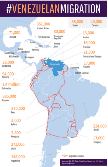
https://www.worldbank.org/en/news/feature/2019/11/26/migracion-venezolana-4500-kilometros-entre-el-abandono-y-la-oportunidad
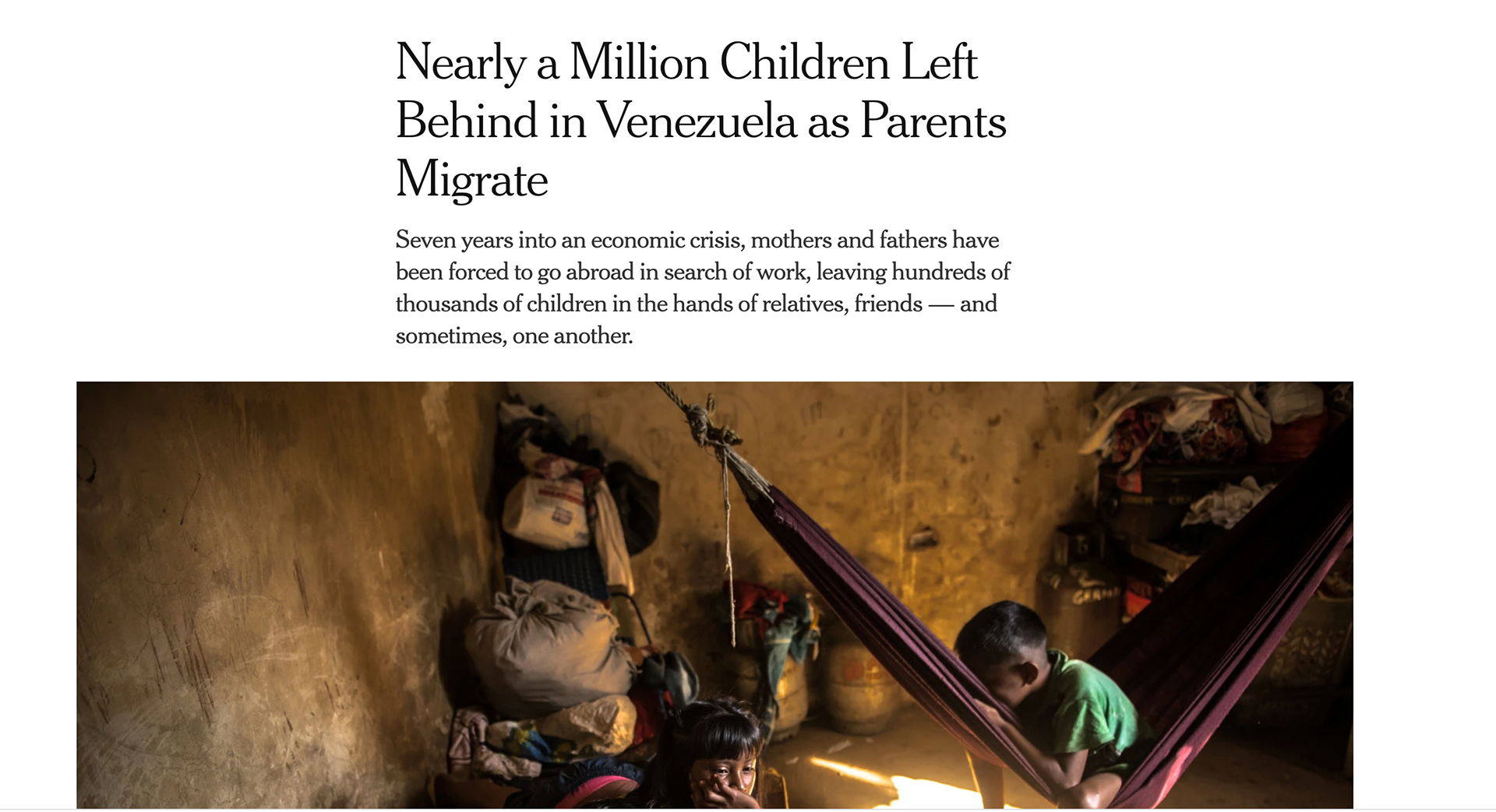
https://www.nytimes.com/2020/03/24/world/americas/venezuela-migration-children.html
https://www.unhcr.org/venezuela-emergency.html
Starting Point:
Having already done a project with data visualization I was a bit clearer and on my way to a much smooth process than with my first project. Much of my research came from organizations such as the UN, and little organizations in Venezuela such as ENCOVI.
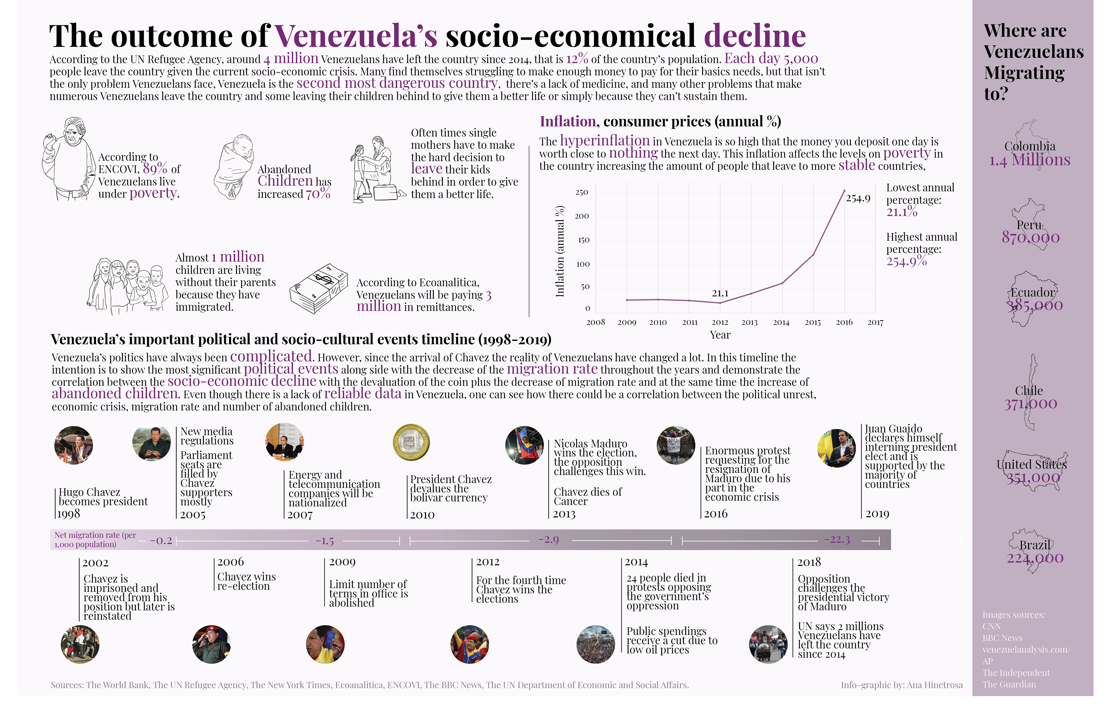
My intention at first was to find out who are the children of the 1 million orphans reported in The New York Times. I wanted to know their age, gender, where they were from, etc. But that was impossible, I tried reaching out to organizations that work with kids in Venezuela but there was no luck. For that reason, I shifted my focus on what caused the huge number of Venezuelans leaving the country.
First version:
At first I wanted to make most of the info-graphic with illustrations, but realized that I needed to show more clearly what happened in Venezuela that has made so many people leave the country. The best way I thought is to make a timeline with the many events that have occurred in Venezuela with the hope to show how they have affected the migration rate and the number of abandoned children.
Data Collection:
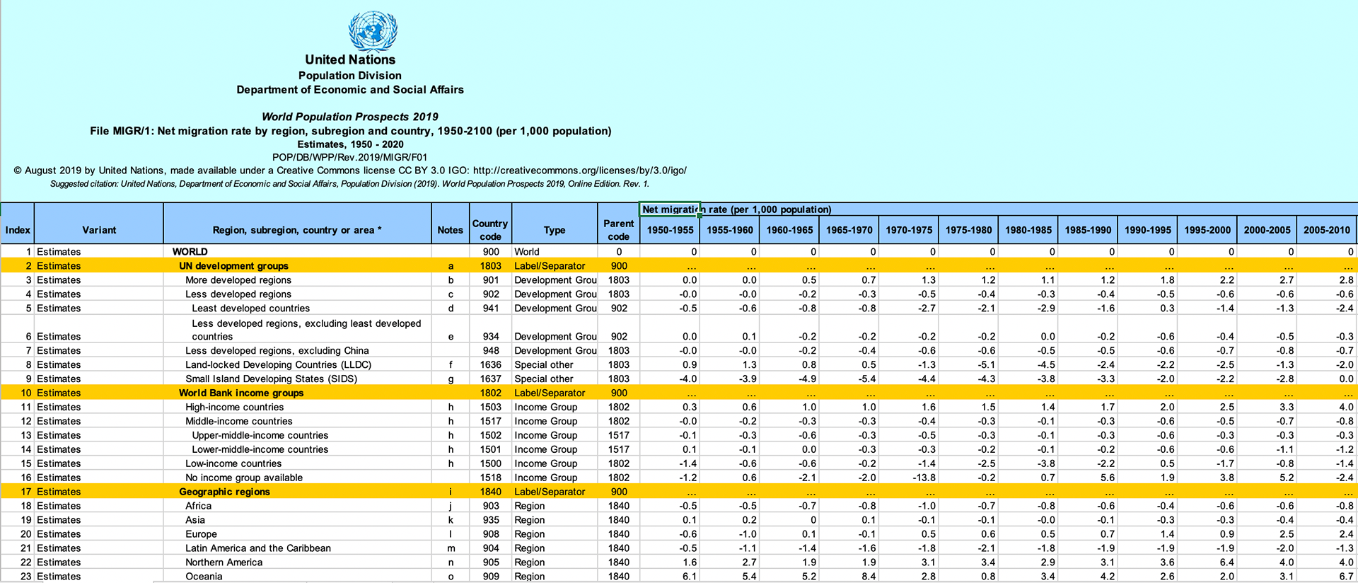
Like I mentioned before, my main goal was to talk uniquely about orphan children in Venezuela in the last couple of years. But finding data about that topic was hard, so I went into finding data about minimum wages, and migration rates, in order to get a better picture of why people might be leaving. Is no secret that the political situation in Venezuela has caused many problems to Venezuelans. One of the data I wanted to have was that of the inflation rates. During the Chavez/Maduro era the inflation rate in Venezuela has skyrocketed, reaching absurd numbers. For this data, I could only find data from 2009 to 2016, which was no surprise as that is common in Venezuela.
Challenges I encountered:
Data, data was the biggest challenge, it was hard for me to find clean data about certain things.
Time management, making a data visualization takes times and attention to detail, which is hard to accomplished if done with little time.
Time management, making a data visualization takes times and attention to detail, which is hard to accomplished if done with little time.
Reflection:
Like I mentioned in one of my past projects: finding good, reliable data is hard.
Making data a story is way more challenging than what I thought, I often saw data visualization in newspapers that were cohesive and easy to understand. However, when I was doing this project and the one about Mass Incarceration, it was really difficult for me to tie all my graphs and thoughts together into something people could easily understand, and that is something I will try to improve, as I think it is a great skill not only for data vis but for all aspects of storytelling and communication.
Making data a story is way more challenging than what I thought, I often saw data visualization in newspapers that were cohesive and easy to understand. However, when I was doing this project and the one about Mass Incarceration, it was really difficult for me to tie all my graphs and thoughts together into something people could easily understand, and that is something I will try to improve, as I think it is a great skill not only for data vis but for all aspects of storytelling and communication.