A data visualization on Mass Incarceration.
Type: Data Visualization
Role: Designer, creative director, writer.
Year: 2020
This is my first data visualization project on the problem of mass incarceration and the impact the bail system has on low-income families and people of color in The United States for my Intro to Data Visualization class with Professor Alberto Cairo.
1st Step: what direction to go?
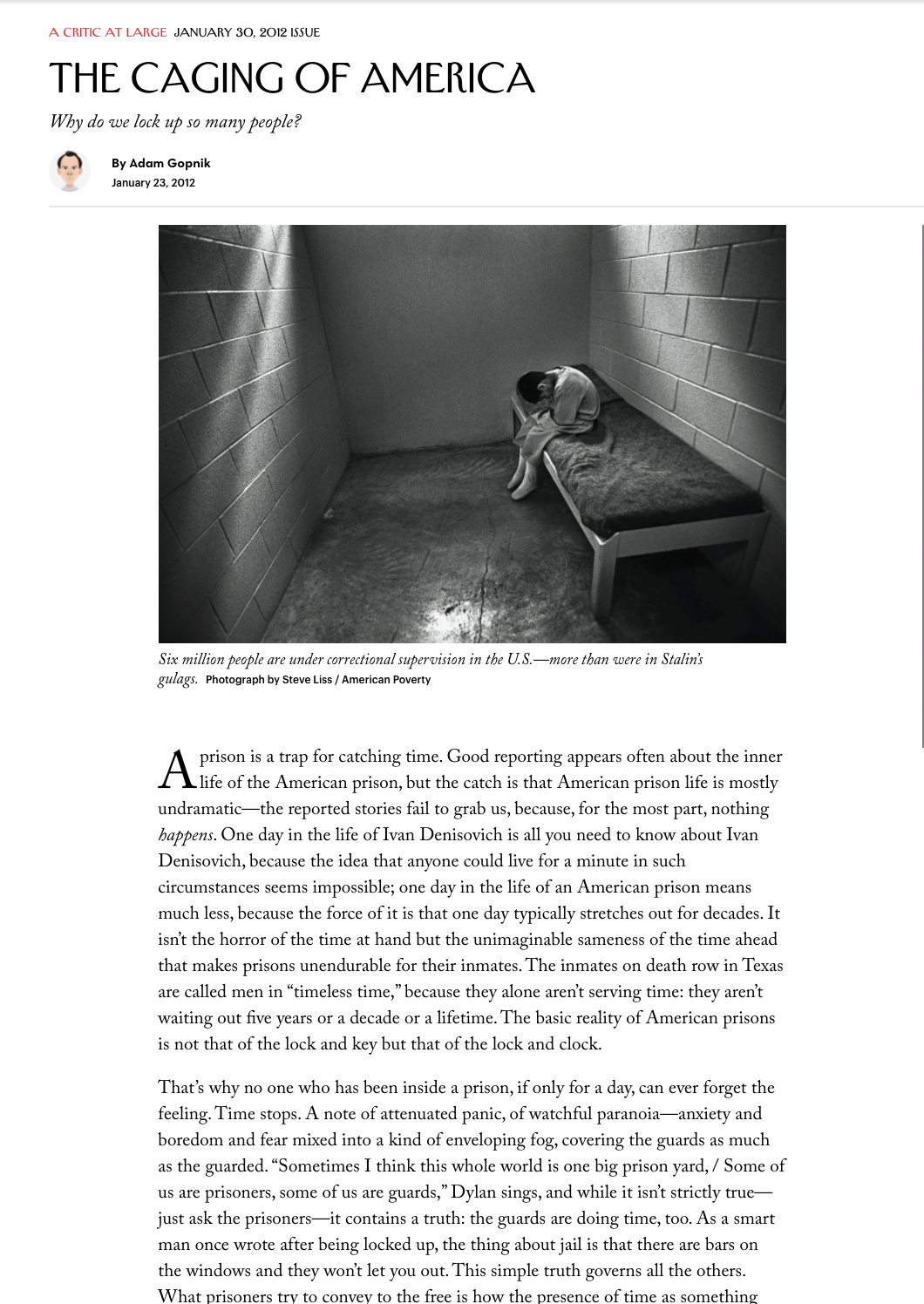
We were prompted to read The New Yorker article, The Caging of American, and decide which part of the problem of mass incarceration we are going to focus on. After going through each of the links provided, plus other outside sources such as an article in VOX (https://www.vox.com/future-perfect/2018/10/17/17955306/bail-reform-criminal-justice-inequality) I felt that one of the most relevant issues with mass incarceration is the Bail System. Now that I had my topic, it was time to find the data.
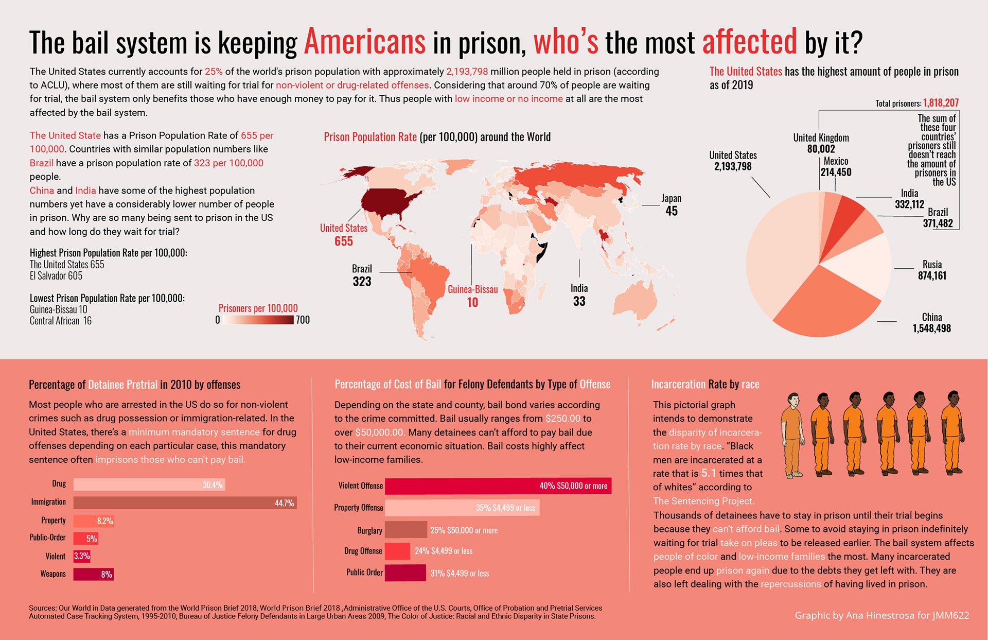
In the process of understating the bail system, I found that a great majority of people in prison are there because of non-violent or drug-related offenses. I also found that while most of the people in prison are white, the percentage of incarcerated black people is much higher. I wanted to make sure all of these findings were clear in my visualization.
In the process of understating the bail system, I found that a great majority of people in prison are there because of non-violent or drug-related offenses. I also found that while most of the people in prison are white, the percentage of incarcerated black people is much higher. I wanted to make sure all of these findings were clear in my visualization.
Data Collection:
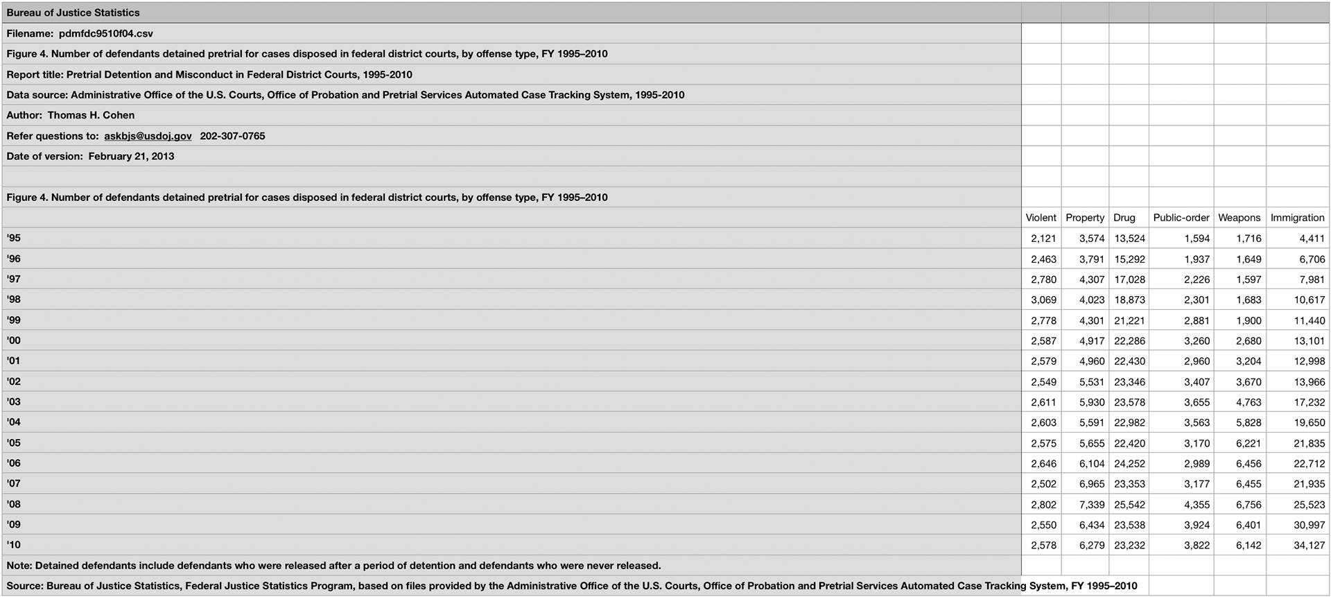
Once I knew my topic was going to be about the bail system, I searched for data sets that were as current as possible and that were clear. As a person that has never worked with data, I had difficulties knowing exactly what to look for in order to demonstrate the consequences the bail system has in relation to the mass incarceration of people in the US. I found myself going through great amounts of data without really knowing what they meant. After carefully going through them I finally found enough data to start creating my visualization.
Charts,Graphs, Maps:
When deciding which way I was going to present the data I had collected I took into consideration what graphs and charts I understand quickly. I wanted to make sure my visualization was clear and easy to go through.
Choropleth map: I used this with the purpose to display how The United States out of ALL the countries, many having similar or more population number they still have the highest rate of prison population per 100,000.
Pie chart: they are easy to understand, same that with the choropleth map, I wanted to show how the United States has 25% of all the prison population in the world.
Bar Graph: one of the key aspects of mass incarceration and bail is that many of the people who are detained are for non-violent offenses. I wanted people to visually realize how most of the detainees who are waiting for trial have not committed a violent crime. Same with demonstrating how much bail could be depending on the crime committed.
Challenges encountered:
Some of the data that I found were of many years ago, and some were hard to use, and for that I used Tabula, which helped me extract data sets from reports that had important data about my topic.
Reflection:
- Finding good, reliable data is hard.
- It takes time to generate well designed and real data that can be used as a reliable source.
-There’s MANY little details in relation to design and alignment that need to be taken care off, if not the visualization ends up looking bad.
-The main thing I learned is that when working with data you have to be well organized and put clear labels in each of the data sets, otherwise is pretty easy to get confused.